All-New Inhumans #9

comiXology summary:
All-New Inhumans #9. Gorgon stands trial! What crime could Gorgon have committed to land him in an Inhuman jail? And what does Ana Kravinoff have to do with it all?

The bait and switch 🙁

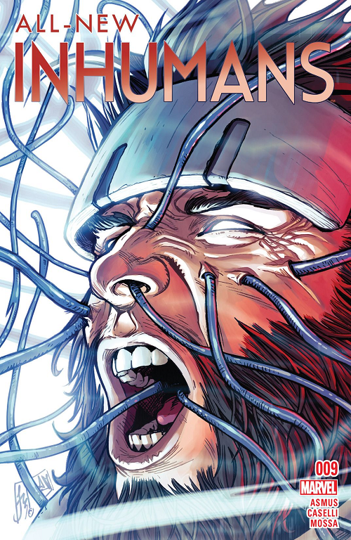
Last night at FNM (writeup coming to a Fetchland near you) I saw this week’s cover… All-New Inhumans #9.

Look at that cover for a second. Quick-like; like you were passing it on a comic shop rack, mayhap on the way to your second round of Standard. Note this is a Marvel comics cover. Seriously: What character do you see?

Wolverine, right?

I immediately moved to the rack. I thought Wolverine was dead* in Marvel Comics**.

I mean, I wasn’t necessarily going to jump into All-New Inhumans with the ninth issue, but I did want to know what was up with Wolvie. Curiosity, you grok?

How could it be anyone else?

I mean, the cover is an obvious homage to the various Marvel Comics Presents covers that Barry Windsor-Smith did in the early 1990s. There are many, but this seems like the most direct inspiration:
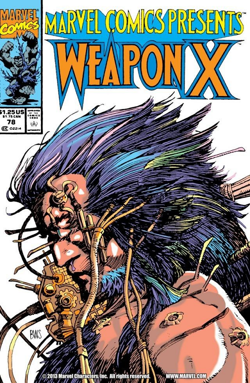
Marvel Comics Presents #78
Barry Windsor-Smith’s cover to Marvel Comics Presents #78

No beef with cover artist Stefano Caselli; seriously… But that All-New Inhumans cover sure smells like a lift homage to BWS’s classic, doesn’t it?

TLDR: IT’S NOT WOLVERINE ON THE COVER.

Per the ComiXology summary, it’s Inhuman Gorgon on the cover; I guess you would know that if you were a regular reader of All-New Inhumans… But as a comics cover (i.e. something that is meant to draw in potential readers who are not regular subscribers of a comic on a monthly basis) I didn’t know it was Gorgon. I thought maybe I’d get the DL on a once-central character who has been dealt a really raw hand in the comics universe [that in other circumstances would have grown right back].

Boo, All-New Inhumans #9 cover!

Boo… And well played.

LOVE
MIKE

* Except for Old Man Logan; another time.
** Wolverine being Marvel’s more-or-less most popular character… Whose film rights are owned by someone else.

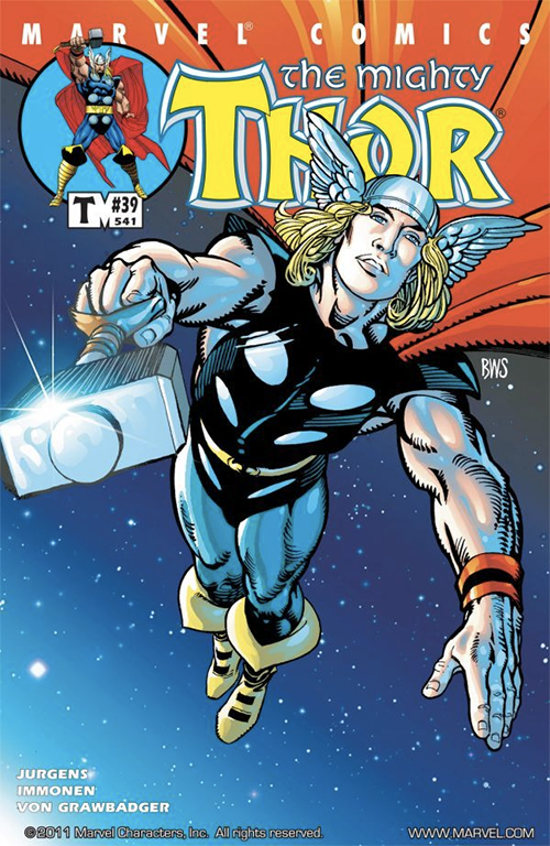
The Mighty Thor #39

ComiXology Summary:
While Thor and Jake have their wounds tended to by Asgardian healers, Odin and Balder discuss the fate of the Destroyer. Will Odin finally end the dark legacy of the Destroyer Armor?

Jake?

Odin?

Balder?

The Destroyer [Armor]?

I don’t know about you but I don’t see any of these cats or any of that jazz on this cover.

To me, this is a pretty non-specific cover that could have been slapped on any number of issues of The Mighty Thor… But just so happens to be on #39-slash-#541.

Non-specific or not — in terms of subject matter and execution — this cover is pretty specifically awesome, and showcases a lot of what makes Barry Windsor-Smith such a revered illustrator.

A lot of guys doing comics just want to do comics; they lack drawing fundamentals which they make up for (somewhat) with tons of lines, extra muscles, skimping on feet, and endless teeth. On the other hand you have an artist like Barry Windsor-Smith; a REAL ARTIST (all in caps) who happens to be putting a superhero on a piece of paper.

I find his decisions really thought provoking… Essentially no background; but a weird off-center figure layout. A mix of really fine lines around the thighs and boots with these thick, cartoon-y strokes around everywhere else. The ink quality looks really “wet” and confidently loose, without sacrificing an air of precision. Windsor-Smith cheats with the inks, though. To my mind there is little if any finishing differentiation between Thor’s skin, his leggings and his hammer / helmet. Now obviously his helmet is metal, but it is is Mjolnir that gets the more dramatic metallic lighting effect (funny, I “know” Mjolnir is Uru, but I usually “read” it as stone when looking at a Thor picture). Then we have these totally random horizontal slashes across the white circle-thing on Thor’s right pectoral (I’ve always read those as stylized metal discs on leather armor, which would make the particular execution of these slashes completely illogical).

The only things that get a different ink finishing quality are Thor’s wrist straps and boots (which are both “cloth”).

But I don’t care. This cover ultimately works, and I love how the line work comes out, differentiation or no (especially on Thor’s flowing golden locks). The visual figurative language here reads classic funnybook but Windsor-Smith elevates it with his Renaissance-influenced compositional capabilities. I generally find “blatantly obvious Photoshop filters coloring” garish but there is so much negative space (BWS feels no need to cover up bad form with endless speed lines and cross hatching) the colors work just fine; besides which, I doubt he colored it himself.

Finally — and this is a “fellow artist” thing that I wouldn’t expect most folks to pick up on, but one that I get a kick out of — note Barry Windsor-Smith’s signature, “BWS”. He signs in white ink right under Thor’s cape on the right side of the image. “BWS” has another meaning for comics illustrators… “black with stars”. As onetime comics editor BDM taught me during the first Comic Book Idol, “BWS” is shorthand for pencilers to indicate generic nighttime sky finishes to their inkers. Here BWS’s “BWS” is a tongue-in-cheek background instruction as well as signature.

Super fun, super well-executed, cover that works from one of the genre’s finest talents. I would definitely have picked this book up to look at if I saw it on the stands, and I probably would have stuck around for Stuart Immonen when I did. Good choices all around.

LOVE
MIKE